Sweet Brandin’
Imagine you had a friend that always dressed in bright magenta and pumpkin orange. Whenever you spoke, your friend was bubbly and abbreviated many words in a casual manner.
Your friend's bold yet casual nature makes you feel energized and welcomed. You're loyal to the comfort you find with your friend and look forward to the fun you'll have together.
That's the success that Dunkin’ has had with marketing to consumers, turning them into fans of the brand.
For sure, it's the delicious products that keep customers as fans; but the branding keeps Dunkin’ top-of-mind. When you see someone walk in with the pink and orange box, you’re immediately hungry for a sweet treat.
When Dunkin’ updated their branding in 2018, the focused turned to coffee. The visual emphasis stayed with the bubbly font and colors, every Dunkin’ fan has grown to love.
In marketing, they keep their focus on convenience and comfort by incorporating a shorthand style of writing that is based on the logo’s apostrophe. With the shorthand content and the iconic bubbly font, a Dunkin’ advert is clearly recognizable even without a logo.
With excellent all around brand decisions and delicious product standards, Dunkin’ will be growin’ for generations to come.
[BB:1-3]
Carefully Chosen Brand Colors
Branding Bits 1
Dear Lovers of all things Brand Design:
Does the consistent color of a brand carried from printed promotions, digital assets, signage, interior designs and employee apparel make you smile? Do the subtle changes in a company rebranding make your day? Do you geek out when looking through a Brand Style Guide?
Then Branding Bits is for you!
Here you can read posts that say BRAVO to Bits of Branding genius!
Branding Bits will come to you in snippets or short reads - but never more than a bit of info. Just enough to satisfy a creative's joy in brand details, but also to educate those who have just discovered the satisfaction that comes from the tiny details of consistent design.
In Branding Bits, I’ll celebrate all the parts of a creative brand. Logos and Brand Style Guides are some of my favorite things, but branding is much more than those items alone. When I come across a bit of brand brilliance, I’ll share the creativity for all to be inspired.
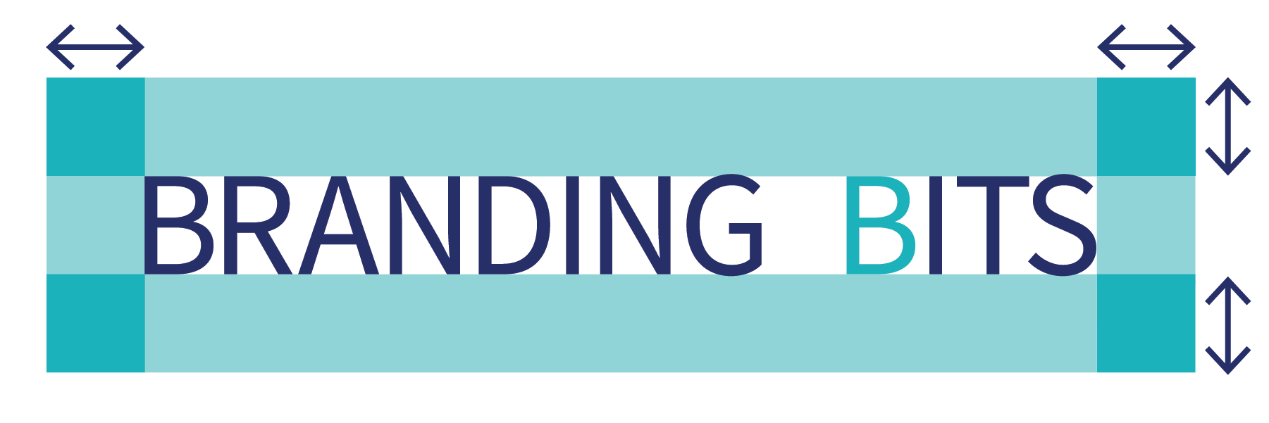
Because I came to love branding through logo design, I had to give Branding Bits a proper logo. The Branding Bits logo is on brand with jportfolio.com, incorporating the color scheme of the website. For this logo, the teal of the hover state takes center stage. The font mirrors the website for a consistent typographic feel. The logo shape is a nod to the visual representation of a clear space guideline found in most Brand Identity Guidelines. The voice of Branding Bits Blog will be on brand with Jportfolio, #SeekingCreativity in the world of art and design.
Back with more Branding Bits soon!
[BB:1-1]